Brand Naming Solutions in India.
A well-chosen brand name is halfway to victory!
LOGO DESIGN & NAMING
We, at Abbydraw branding agency, produce ensigns taking into account all the factors that contribute to the expression of the brand’s personality and effective positioning in the request. Being one of the top agencies, we understand that totem development should be grounded not only on creativity, but also take into account all the factors that can impact the perception of the final result by the target followership.
A brand name is created by naming. This system is really sophisticated and creative. Then, we’ll go into great detail regarding the crucial way in furnishing name services as well as the implicit troubles you should watch out for.
So how do you suppose of a name for your business, store, cafe, or brand of goods? Is it doable for you to simply snare a piece of paper, portrait out implicit names, and also pick the stylish one?
First difficulties
The first difficulty: let’s open the secret – just excellent, good, beautiful, or creative does not exist in nature. It becomes such when you believe in it yourself 100%. And for this, you need to think about the name a little earlier – from the idea, the concept of your brand. As soon as you formulate the value of your business, meaning, idea, positioning, some of the questions about the name will disappear by themselves, and you will clearly see a direction, like a ray indicating where to go. Over our many years of experience, we have helped many Russian entrepreneurs and multinational companies to develop a brand name in this sequence.
Effective naming development commences with a deep understanding of the company’s marketing strategy, mission, and values. These essential components lay the foundation for creating a name that resonates with the business or product’s creator and eventually gains widespread belief and trust. When confronted with such a crucial task, it is advisable to seek assistance from professionals, preferably market leaders, to ensure a successful outcome.
There is another difficulty encountered on the path of faith. To faith in the future name.
The names presented to you are yet to become established brands. They are not the names of billion-dollar companies, not the names of product brands found on every supermarket shelf or in our refrigerators, and not the names of restaurants where booking a table is a must. Currently, these are names that lack recognition, and many people tend to criticize them, overlooking their potential. They are like rough diamonds that have not yet been cut to reveal their dazzling brilliance. Though we haven’t reached the final cut, a decision must be made now.
To achieve effective naming development, it’s vital to thoroughly grasp the company’s marketing strategy, mission, and values. These essential elements are the building blocks for creating a name that aligns with the vision of the business or product creator and instills belief and trust in others. When tackling a similar task, seeking guidance from experienced professionals, preferably market leaders, is a prudent choice to ensure the most favorable results.
Logo goals
Logo development is crucial for enhancing brand individuality and recognition. It involves creating a distinctive image and font solution that significantly impacts parameters like: (Please note that the rest of the parameters were not provided, so I am unable to complete the list without additional information.)
- Memorability . The characters, simple geometric shapes and symbols used in your logo will increase the memorability and, accordingly, the recognition of the logo – all in order to easily and effortlessly take their place in the head of your consumer;
- Uniqueness . There are only seven notes in the world, but there are a lot of different melodies. Tell the essence of your business in the logo and then it will be your unique story;
- increasing brand loyalty on the part of the target audience;
- relevance to the core brand strategy.
- Uniqueness . There are only seven notes in the world, but there are a lot of different melodies. Tell the essence of your business in the logo and then it will be your unique story;
- increasing brand loyalty on the part of the target audience;
- relevance to the core brand strategy.
Logo design, tools
To do this, we use tools – there are only four of them: FONT, SYMBOL, SHAPE, COLOR . And in this article, we would like to share with you the secrets of how each of these tools works, how each tool is responsible for what, and how you could use them to create your own unique logo so that it really conveys the essence of your business and uniquely read by your target audience.
1. FONT LOGO
Font is one of the powerful design tools for logo design. First of all, you need to understand that you need a font to create inimitable and unique images, as well as create communication between your brand and your target audience so that people can understand the meaning of your business. Fonts don’t need to be played with. They just need to be used correctly, understanding when and which one to use. So, how to use different styles correctly in order to create the right image with their help.
For example, you have a large company built on a vertical hierarchy, and you have serious ambitions. Or you want to emphasize your status, solidity and stability, the scope of your business, give your brand more significance – use only capital letters .
This is a good choice for large businesses, state-owned companies, as well as brands from the luxury segment.
If your company is based on a horizontal hierarchy and you would like to demonstrate it. Or you would like to emphasize the availability of goods or services , easy entry, friendliness and democracy – use only small lowercase letters .
If you do something with your hands or in your business, most of it is creativity , then what makes your product or service copyright, and you would also like to keep accessibility and friendliness in communications – use handwritten fonts.
Handwritten letters will give your image man-made, self-expression and lightness.
If you provide services or sell premium products , but in addition to status, you would like to emphasize the traditions that you rely on, then using calligraphic styles will help you .
Calligraphic fonts will highlight your status and highlight your traditional approach.
If your essence is speed, speed, dynamics . You offer services related to “fast” business processes, sports goods – use italics .
Such typographic solutions will add dynamics to your image, so that everyone can read the blurry already upon contact with the logo.
2. SYMBOL LOGO
A symbol is an ancient tool for concluding a meaning or building an image for further communication with the target group. Logos that have some symbols in their architecture are an order of magnitude more noticeable and more memorable than just logos that have only font writing. Symbols were used by religions to create symbols of faith, the first empires to create their symbols of power, noble families to create their own heraldry. Since the 19th century, symbols have been firmly established in commercial design in the consumer market. Symbols are used together with typefaces as combined trademarks and logos.
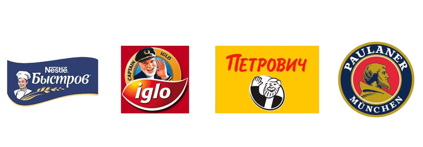
Very often, images of people become symbols. Often these are founders of companies or fictitious traditional images endowed with a certain character, values and behavior. Through these characteristics, communication takes place between the brand and the target audience. Thanks to the symbol, the brand is revealed to the target audience, as if endowing the brand with its qualities.
This is a good choice for large businesses, state-owned companies, as well as brands from the luxury segment.
Animal symbols are no less popular than human symbols. Through images of animals, you can give your brand a certain character.
Abstract graphic symbols are widely used in corporate branding. Thanks to them, you can create technological, environmental and other images.Handwritten letters will give your image man-made, self-expression and lightness.
3.LOGO SHAPE
Form is a powerful tool for building logos with a strong visual impact. And this tool is used in two ways: 1 logo embedded in the form (closed logo), 2 logo using the form.
Simple geometric shapes such as circle, square, triangle focus attention and stimulate memorability much higher than complex abstract shapes. This rule works no matter which method you choose. The simple can be easily described or imagined. Therefore , if you want your logo to be noticeable and memorable, use simple geometric shapes.
Just as effective as geometric shapes, letter and spelling shapes work .
4. LOGO COLOR
You can talk endlessly about color and color ratios how effective these tools are for creating a logo. There is a theory of how certain colors affect the human psyche. But in our work, it is interesting how colors can create mood, form images and how to use this tool effectively when you are designing your logo.
Black.
If you have a “premium” quality product or you are developing your business in the Lux segment , then your logo should be expensive and strict – black color will suit you . This is the color of luxury, chic, rigor and power. Using only capital letters in writing, you will achieve your goal.
Red.
If you want to stand out, add more passion and emotion to your logo, use red. This color is perfect for that.
Yellow.
This color, like no other, is suitable for conveying joy, warmth, optimism, positivity, as well as for conveying energy in your logo . It is loved to be used by people creative, creative agencies for their corporate identity, as well as products that have energy and power.
Orange.
Orange complements yellow in mood. If you want to convey openness and friendliness, this color will be a great solution . It has a lot of warmth and positivity. To do this, use lowercase letters.
Green.
Growth, life and harmony are strongly associated with green. And also if you want to convey naturalness, freshness and environmental friendliness – green is what you need!
Blue.
Do you want to convey peace and serenity ? Build trust and convey reliability ? Or are you a tech company ? Blue is your color!

Violet. The purple color in the logo will help you
emphasize your own individuality and convey sophistication, add mystery and magic .
Evaluation of the effectiveness of the logo
A logo is an effective tool for running your business. Imagine a bank without a logo. Would you trust him with your money? The logo inspires the trust of your customers. A professionally made logo with a corporate identity will inspire even more confidence in your buyer. And if you can formulate in a short form the reason why people should buy from you, then you will receive a constant flow of customers.
As you can see, the logo is only part of the complex for building effective communications with your customers. The logo is a powerful element of commercial design. Therefore, his assessment in the context of “like / dislike” is unprofessional. How to evaluate the logo for effectiveness?
The logo has three key parameters by which it should be evaluated.
The logo should be prominent , easy to read and grab the attention of your customer. See where your logo will be used. The first thing you should see is a logo, whether on a supermarket shelf if it is used in packaging design, or in an urban environment if it is a sign for a shop or cafe.
The logo must be memorable. Look at the logo, close your eyes. What can you remember? This is a good memory test. If your logo can be remembered by an ordinary person, then you have a chance of a repeat purchase or contact. So you “penetrated into the head of your buyers.”
The logo should communicate one key idea of your business , creating a unique image for you that you will broadcast to customers and clients. To do this, the following tools will help you: FONT, SYMBOL, SHAPE, COLOR . You have already read about each of them at the beginning of this article.


