In the bustling world of consumerism, where products jostle for attention on crowded shelves, packaging has become a powerful canvas for brand expression. Among the myriad elements vying for recognition, bold typography, and striking graphic elements have emerged as formidable tools. In this blog, we’ll explore the dynamic interplay of bold design in packaging, examining how innovative typography and graphic elements not only catch the eye but also communicate brand identity with unparalleled flair.

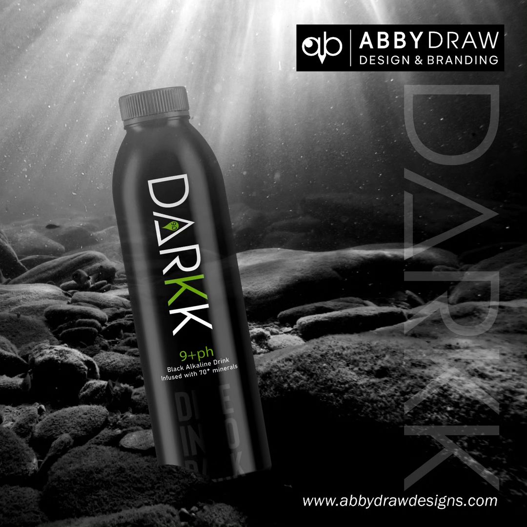
Bold typography isn’t just about standing out; it’s about speaking volumes without saying a word. Brands are adopting distinctive fonts and lettering styles that become synonymous with their identity. From sleek and modern sans-serif fonts to vintage-inspired serifs, typography communicates the brand’s personality and sets the tone for the entire product experience.
Bold typography is often enhanced by strategic contrast. Whether it’s a high-contrast color scheme, the juxtaposition of font styles, or the interplay of light and shadow, contrast grabs attention and guides the viewer’s focus. Brands are using this technique to draw consumers in, creating packaging that is not just seen but experienced.
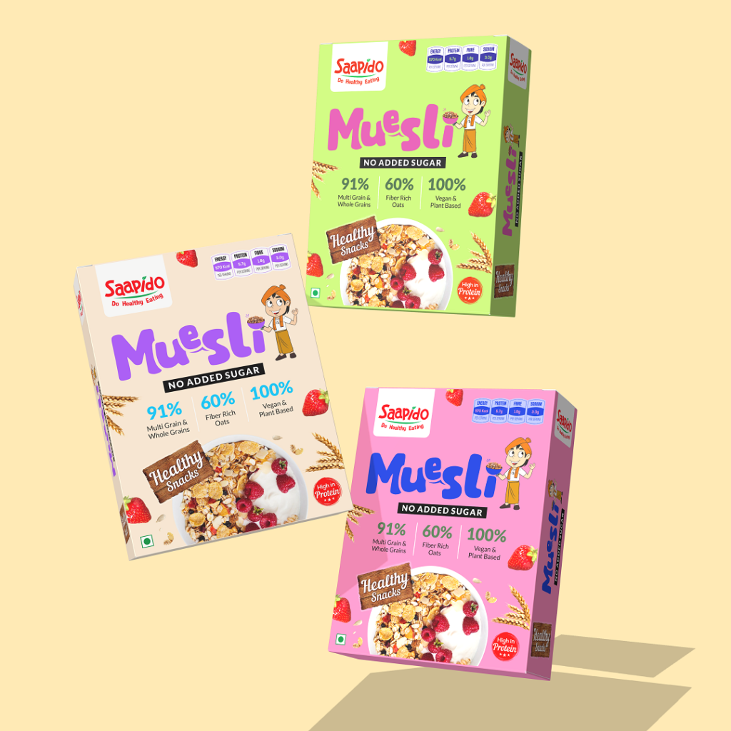
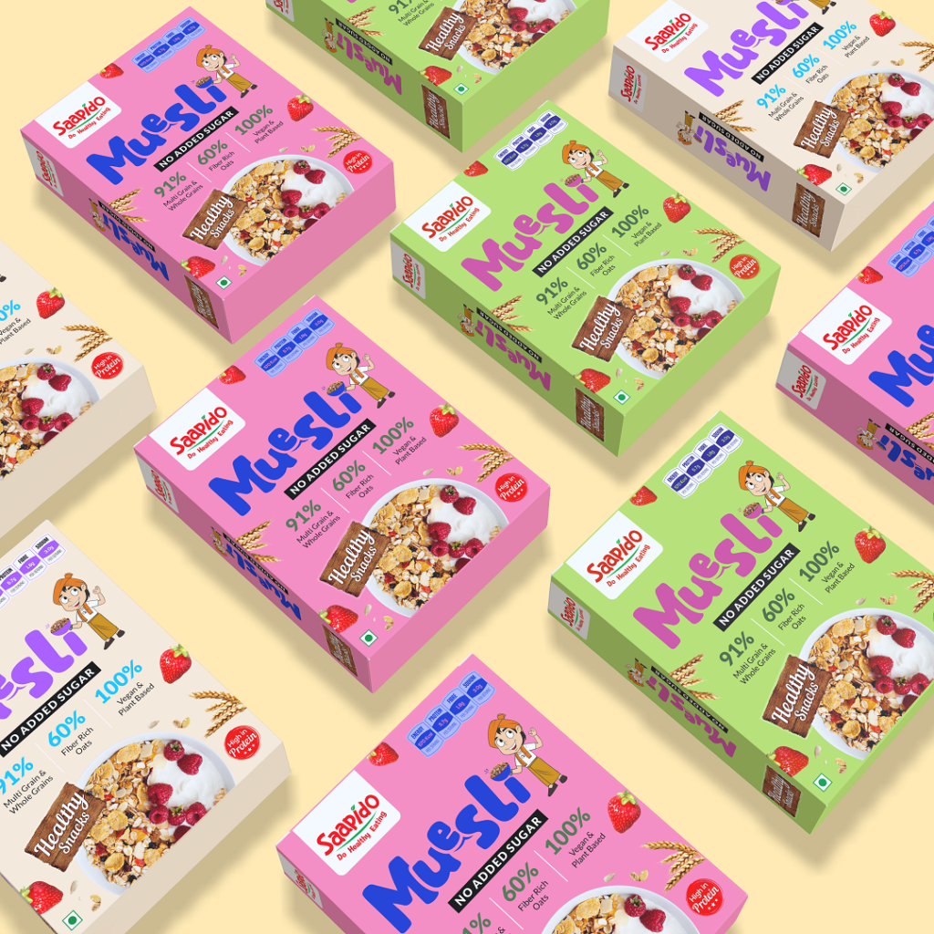
Graphics on packaging have evolved beyond mere decoration; they are now storytelling elements. Bold graphic elements convey narratives, evoke emotions, and provide consumers with a visual journey. Intricate illustrations, abstract designs, or bold patterns contribute to the overall aesthetic, creating packaging that tells a compelling story about the product and its origins.
Bold design doesn’t always mean complexity; minimalism has found a place in packaging as well. Clean lines, strategic negative space, and a limited color palette contribute to a bold and impactful design. Minimalistic packaging with bold typography exudes sophistication, allowing the product to speak for itself.
The choice of color is a crucial element in bold packaging design. Brands are tapping into color psychology to evoke specific emotions and associations. Whether it’s a vibrant, energetic palette or a subdued, sophisticated scheme, colors work in harmony with bold typography to create a visual language that resonates with the target audience.
Bold typography transcends language barriers. Brands are increasingly using typography as a universal design language, allowing their packaging to communicate across cultures. Iconic logos, symbols, and universally recognizable fonts contribute to packaging that speaks to a global audience.
Some packaging designs take bold typography a step further by incorporating interactive elements. Typography that transforms or shifts when the package is opened, revealing hidden messages or additional information, adds an element of surprise and engagement to the unboxing experience
In the ever-evolving landscape of packaging design, bold typography and graphic elements have emerged as indispensable tools for brand communication. Whether it’s through expressive fonts, captivating graphics, or strategic use of color, packaging has become a canvas where brands can showcase their personality, tell stories, and connect with consumers on a visual and emotional level. Bold design isn’t just about catching the eye; it’s about leaving a lasting impression, turning every product into a work of art on the shelf. As we move forward, the marriage of bold typography and graphic elements will continue to shape the visual identity of brands, making packaging an integral part of the overall consumer experience.